First, we loaded the NBA dataset and observed its structure. The dataset contains five columns: Name, Team, Position, Birthday, and Salary. This gives us a good starting point to explore various aspects of the data, such as salary distributions among teams, age distribution of players, and more.
import pandas as pdimport seaborn as snsimport matplotlib.pyplot as pltfrom datetime import datetimefrom itables import init_notebook_modefrom itables import shownba = pd.read_csv("https://bcdanl.github.io/data/nba_players.csv")show(nba)
Our initial peek at the data reveals some potential areas for cleaning: - Handling missing values, especially in the Salary column. - Converting the Birthday column to a datetime format to facilitate age calculations.
Let’s start with the salary distribution among teams using seaborn for visualization.
# Handle missing values in 'Salary' by replacing them with the median salarymedian_salary = nba['Salary'].median()nba['Salary'].fillna(median_salary, inplace=True)
/var/folders/_m/d6jf0jhd2zzdfd5kzdhl_24w0000gn/T/ipykernel_79892/1671011424.py:3: FutureWarning: A value is trying to be set on a copy of a DataFrame or Series through chained assignment using an inplace method.
The behavior will change in pandas 3.0. This inplace method will never work because the intermediate object on which we are setting values always behaves as a copy.

For example, when doing 'df[col].method(value, inplace=True)', try using 'df.method({col: value}, inplace=True)' or df[col] = df[col].method(value) instead, to perform the operation inplace on the original object.


  nba['Salary'].fillna(median_salary, inplace=True)
# Set the aesthetic style of the plotssns.set_style("whitegrid")# Calculate total salary by teamteam_salary = ( nba .groupby('Team')['Salary'] .sum() .reset_index() .sort_values(by='Salary', ascending=False))# Plot total salary by teamplt.figure(figsize=(10, 16))sns.barplot(data = team_salary, x ='Salary', y ='Team', palette ='coolwarm')plt.title('Total Salary Distribution Among NBA Teams')plt.xlabel('Total Salary')plt.ylabel('Team')plt.xticks(rotation=45)plt.show()
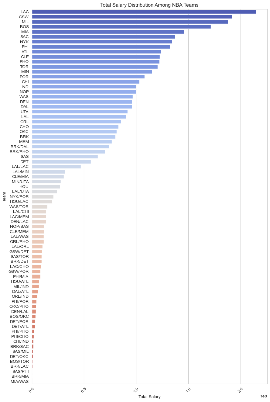
The visualization above displays the total salary distribution among NBA teams, with teams sorted by their total salary expenditure. This bar plot reveals which teams are the biggest spenders on player salaries and which are more conservative. The color gradient provides a visual cue to easily distinguish between the higher and lower spending teams.
Notice that Portland Trail Blazers has the highest total salary followed by Golden State Warriors and Philadelphia 76ers, and Memphis Grizzlies has the lowest total salary.
Player Age Distribution
Next, let’s explore the Player Age Distribution across the NBA. We’ll create a histogram to visualize how player ages are distributed, which will help us understand if the league trends younger, older, or has a balanced age mix.
# Convert 'Birthday' column to datetime formatfrom dateutil import parser# nba['Birthday'] = nba['Birthday'].apply(lambda x: parser.parse(x))# Now, let's calculate the age of each player# nba['Age'] = (datetime.now() - nba['Birthday']).dt.days // 365# Plot the age distribution of NBA playersplt.figure(figsize=(10, 6))sns.histplot(nba['Age'], bins =15, kde =True, color ='skyblue')plt.title('Age Distribution of NBA Players')plt.xlabel('Age')plt.ylabel('Count')plt.show()
/Users/bchoe/anaconda3/lib/python3.11/site-packages/seaborn/_oldcore.py:1119: FutureWarning: use_inf_as_na option is deprecated and will be removed in a future version. Convert inf values to NaN before operating instead.
  with pd.option_context('mode.use_inf_as_na', True):
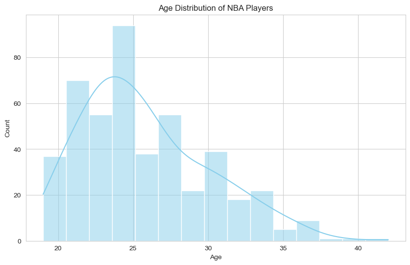
The histogram above shows the age distribution of NBA players, with a kernel density estimate (KDE) overlay to indicate the distribution shape. The plot helps identify the common ages for NBA players and whether there are significant numbers of very young or older players.
Notice that the majority of players fall within an age range from 24 to 34. There are few players whose age is above 40.
Position-wise Salary Insights
Moving on to Position-wise Salary Insights, we’ll examine how average salaries differ across player positions. This analysis could reveal which positions are typically higher-paid, potentially reflecting their value on the basketball court. Let’s create a box plot to visualize the salary distribution for each position.
# Plot salary distribution by player positionplt.figure(figsize=(10, 6))sns.boxplot(data = nba, x ='Position', y ='Salary', palette ='Set2')plt.title('Salary Distribution by Position')plt.xlabel('Position')plt.ylabel('Salary')plt.show()
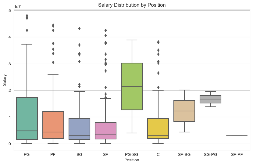
The box plot above illustrates the salary distribution by player position, showcasing the variation in salaries among different positions within the NBA. PG-SG has the highest median salary.
Top 10 Highest Paid Players
Lastly, we’ll identify the Top 10 Highest Paid Players in the NBA. Let’s visualize this information.
# Identify the top 10 highest paid playerstop_10_salaries = nba.sort_values(by='Salary', ascending=False).head(10)# Plot the top 10 highest paid playersplt.figure(figsize=(12, 8))sns.barplot(data = top_10_salaries, x ='Salary', y ='PlayerName', palette ='viridis')plt.title('Top 10 Highest Paid NBA Players')plt.xlabel('Salary')plt.ylabel('Player')plt.show()
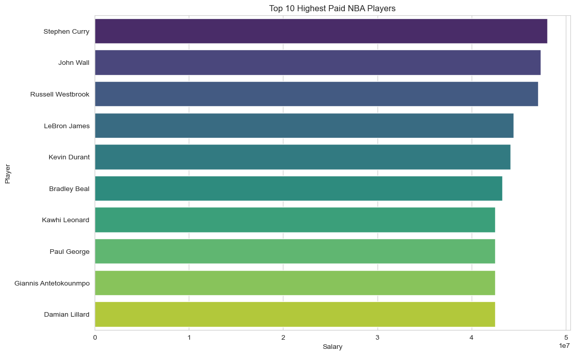
The bar plot above reveals the top 10 highest-paid NBA players, showcasing those who stand at the pinnacle of the league in terms of salary. This visualization not only highlights the star players who command the highest salaries but also may reflect their marketability, performance, and contribution to their respective teams.