library(tidyverse)
library(gapminder)
gapminder <- gapminder::gapminder
view(gapminder)Let’s go over some essentials to create amazing visualizations in GGPlot. We will use the gapminder dataframe. First, we’ll load tidyverse, which is where ggplot2 is stored, and the gapminder dataframe.
Different Types of GGPlots
- Scatter Plot
ggplot(data = gapminder,
       mapping = aes(x = gdpPercap,
                     y = lifeExp))+
  geom_point()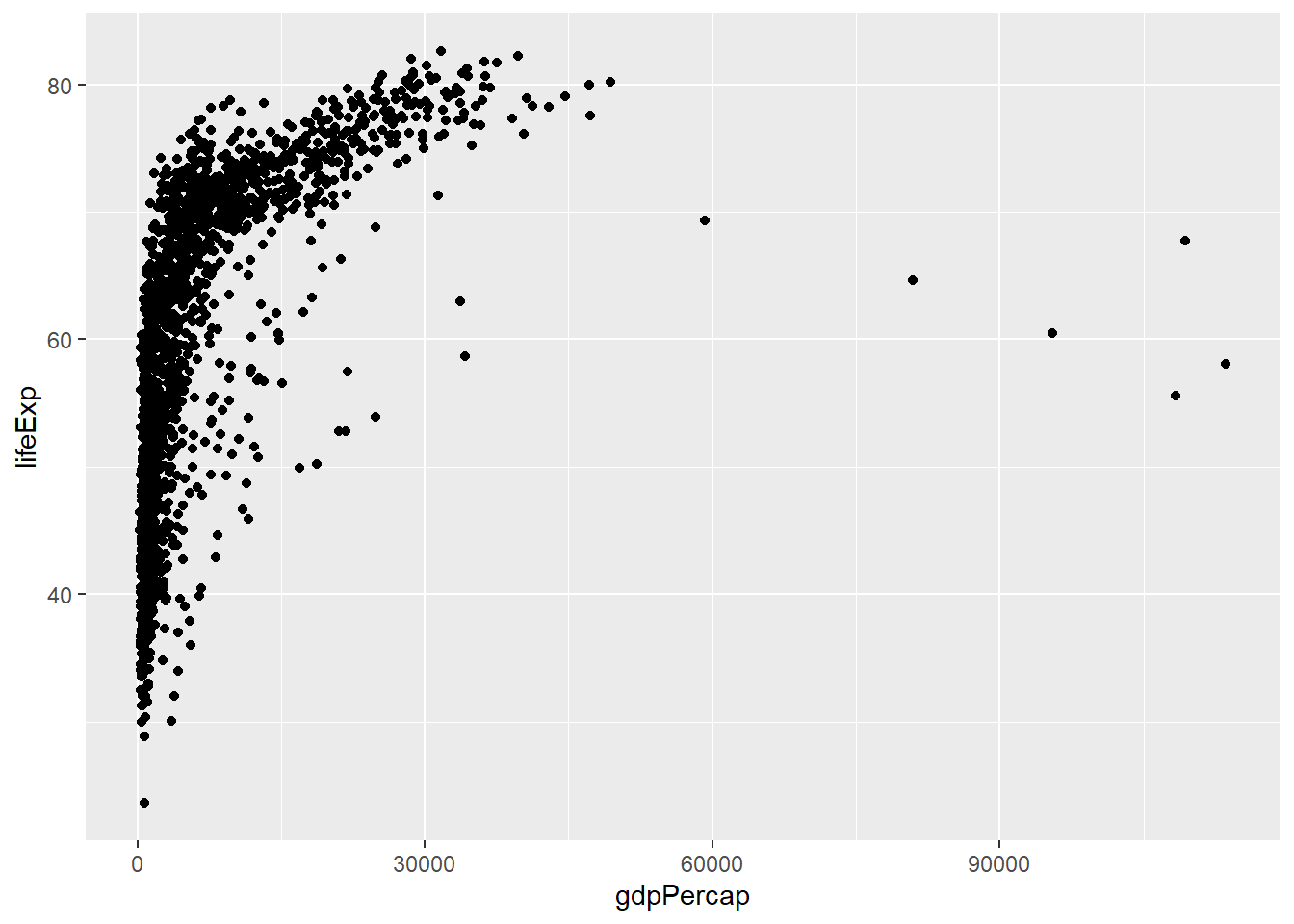
1a. Scatter Plot with curve of best fit
ggplot(data = gapminder,
       mapping = aes(x = gdpPercap,
                     y = lifeExp))+
  geom_point()+
  geom_smooth()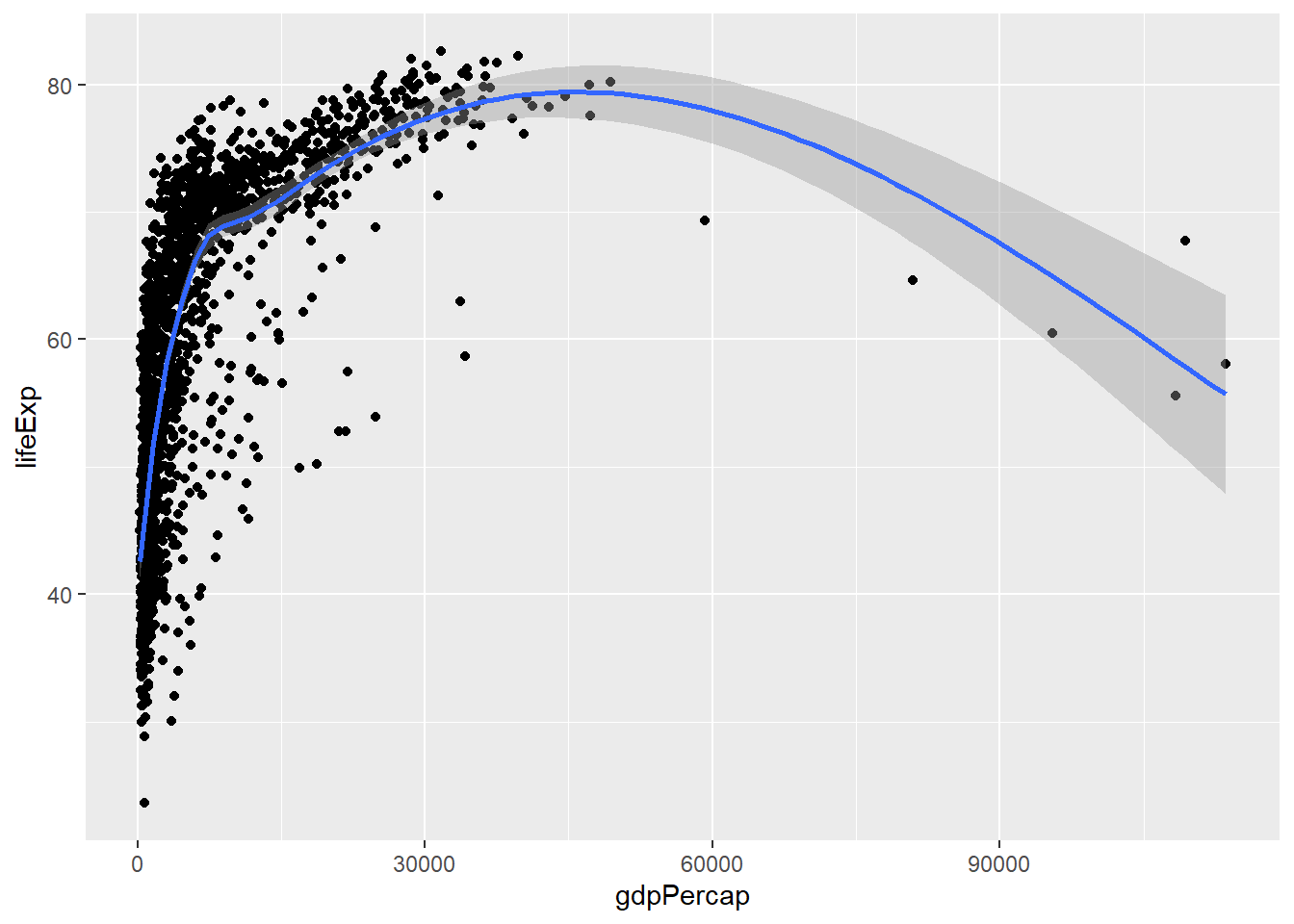
- you can get rid of the shaded part by inserting the argument
se = FALSEingeom_smooth
- Line Chart
- A time series of GPD in the United States from 1952 until 2007.
g <- gapminder |>
filter(country %in% 'United States')ggplot(data = g,
mapping = aes(x = year,
y = gdpPercap))+
geom_line()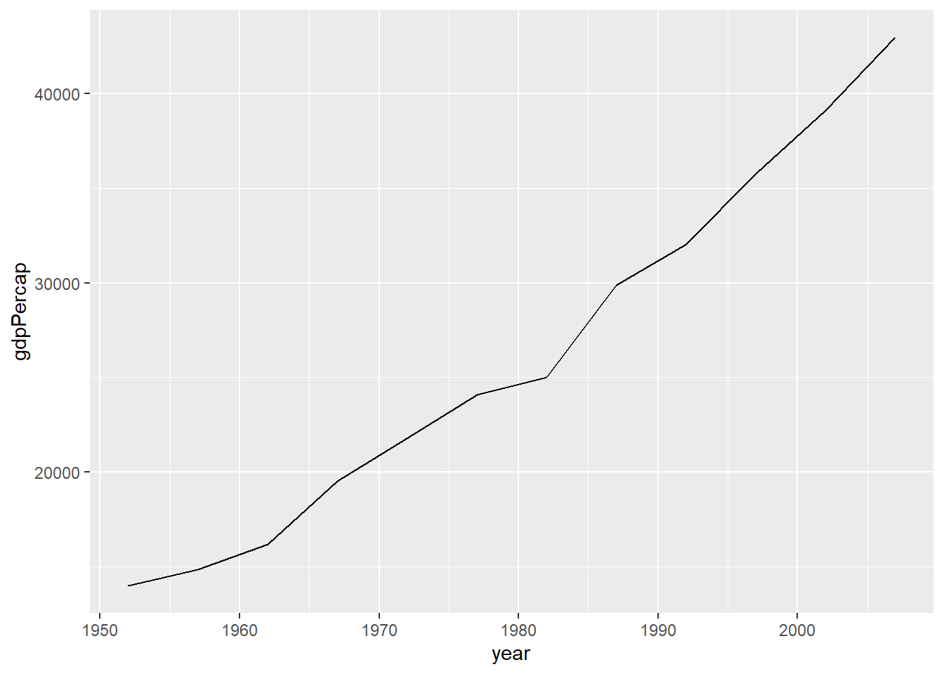
- Bar Chart
- This gives a count of each continent recorded.
ggplot(data = gapminder,
       mapping = aes(x = continent))+
  geom_bar()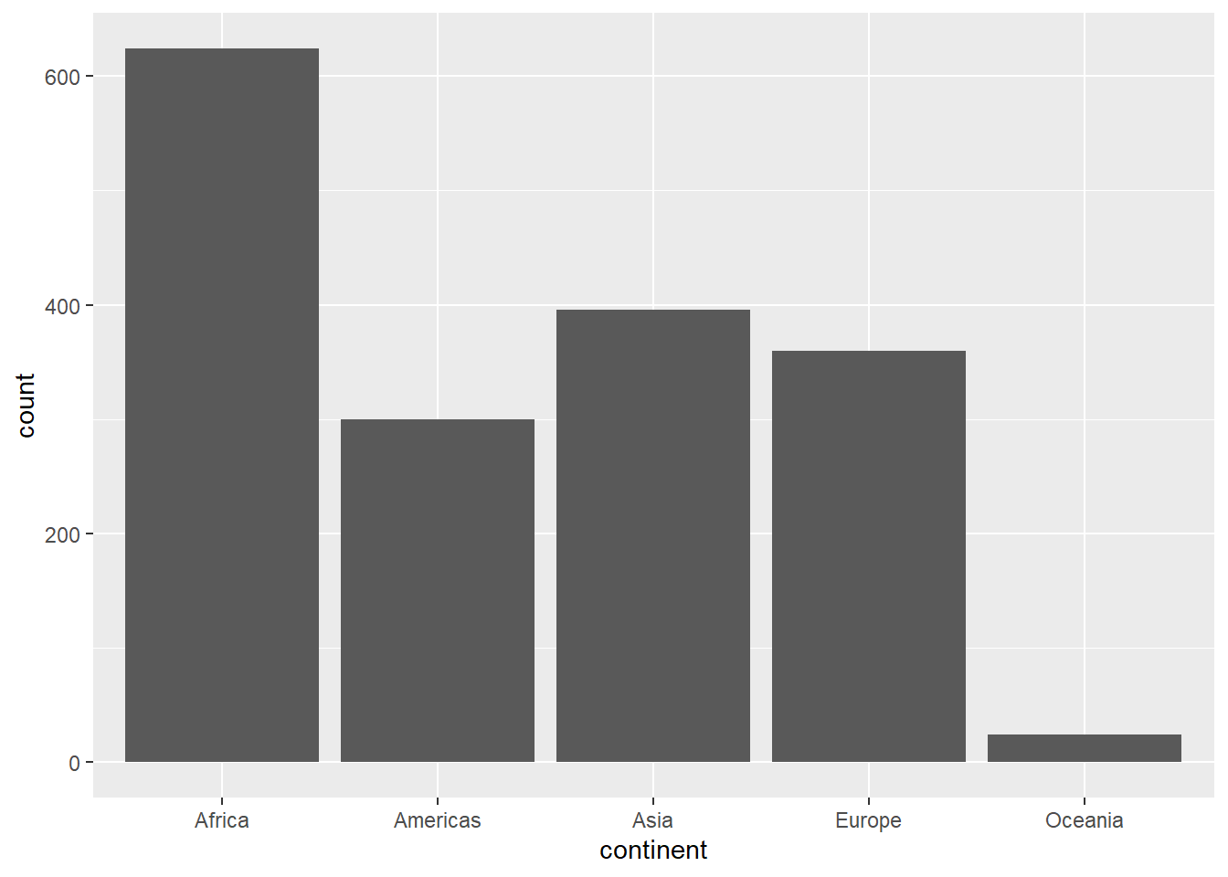
- Box Plot
- Range of GDP across the world in 2007
gdp <- gapminder |>
filter(year %in% 2007)ggplot(data = gdp,
mapping = aes(x = gdpPercap))+
geom_boxplot()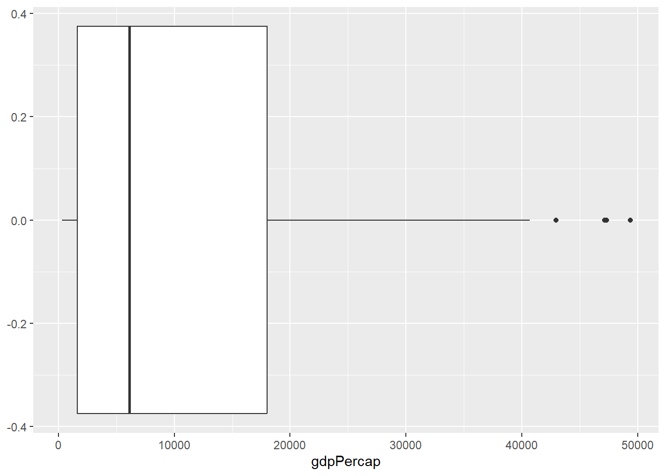
Aesthetic Mapping
In most cases, we will want to go beyond the basic ggPlots. We can do this in a few different ways: - add color - reduce overplotting - facets - add labels
- Color Color can be used to showcase different variables and/or make a graph more aesthically pleasing. Let’s add some color to our bar chart.
ggplot(data = gapminder,
       mapping = aes(x = continent))+
  geom_bar(aes(fill = continent))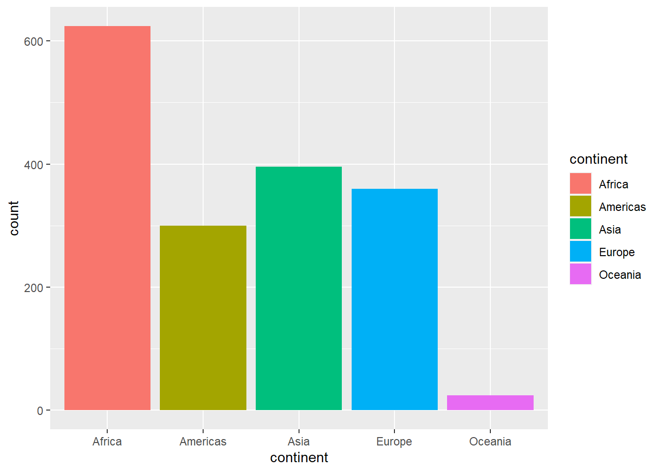
- Although our graph is still the same, it looks much nicer and less boring than the first graph.
Now, lets showcase how each continent varies in our scatter plot.
ggplot(data = gapminder,
       mapping = aes(x = gdpPercap,
                     y = lifeExp))+
  geom_point(aes(color = continent))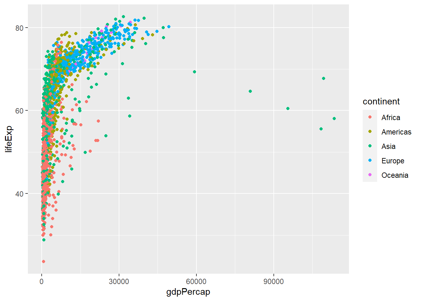
- This gives us insight into how different continents compare to each other’s relationship between GDP Per Capita and Life Expectancy
You might notice that a lot of points towards the left of the graph look very crowded. This is called overplotting, and there is a way to reduce this.
- Reduce Overplotting
- We can use
alphato add transparency to the graph alphais set to a value between 0 and 1- The closer to 0, the more transparent the points become
ggplot(data = gapminder,
       mapping = aes(x = gdpPercap,
                     y = lifeExp))+
  geom_point(aes(color = continent,
                 alpha = .04))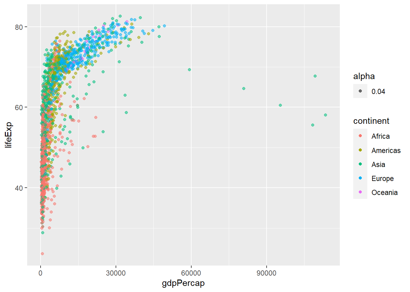
- The points are still jumbled together, but it is easier to see through the overlapping.
With a large quantity of data, sometimes it’s easier to interpret a graph if it is partitioned into smaller graphs by a variable in the dataset. This is where facets come into play.
- Facets Continuing with our scatter plot, separating the points into facets by continent (just like we did with color), will paint a more clear picture about the relationships between GDP and Life Expectancy for each continent.
ggplot(data = gapminder,
       mapping = aes(x = gdpPercap,
                     y = lifeExp))+
  geom_point()+
  facet_wrap(~continent)+
  geom_smooth()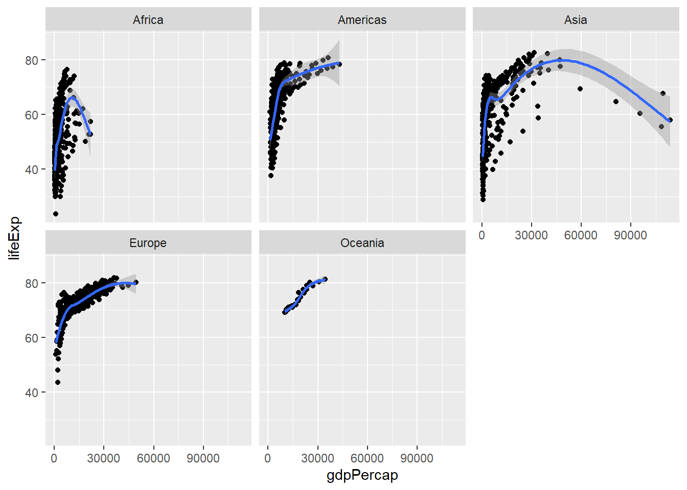
- Labels
- Labels add clarity to a graph. They tell the audience exactly what they are looking at, leaving little room for misinterpretation.
ggplot(data = gapminder,
       mapping = aes(x = gdpPercap,
                     y = lifeExp))+
  geom_point()+
  facet_wrap(~continent)+
  geom_smooth()+
labs(x = "GDP Per Capita",
         y = "Life Expectancy in Years",
         title = "GDP and Life Expectancy Throughout the World",
         subtitle = "Years 1952 Through 2007",
         caption = "Source: Gapminder.")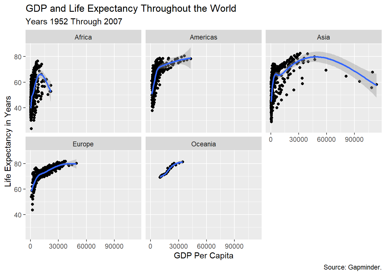
-This is very useful if the variable names in a dataset are not very clear, and because you can add some background information about the data.